Matplotlib plots for LaTeX with PGF
Matplotlib’s pgf
backend
is pretty great, allowing plots to be exported directly from python to pgf
drawing commands. These drawing
commands can be inserted directly into a LaTeX .tex document, and so the
generated plot will be realised at compile time. This method of embedding
plots into a LaTeX document allows a quick and easy method to ensure that fonts
between your document body and plots match.
Saving to pgf
Matplotlib’s pgf backend represents a non-interactive backend. This means that you won’t be able to preview your plot in python, and instead have to export the plot before you can view it. You can change to the pgf backend as:
import matplotlib as mpl
# Use the pgf backend (must be set before pyplot imported)
mpl.use('pgf')

import matplotlib.pyplot as plt
It’s important to note that the backend must be set before importing matplotlib’s pyplot
interface. Once we have set the backend, we can proceed to plot as usual. Here
I plot realisations from a normal distribution, and save the output to a file named
norm.pgf.
from scipy.stats import norm

x = norm.rvs(size=100)
y = norm.pdf(x)

plt.scatter(x, y, marker='x')
plt.savefig('norm.pgf', format='pgf')
It’s as simple as that. We have now exported a plot to pgf drawing commands, ready to be inserted in LaTeX.
Inserting pgf images into LaTeX
Typically, we insert figures into LaTeX with the \includegraphics command. However,
we cannot insert our pgf plots this way. Instead we must make use of the pgf package
and the \input command:
\documentclass{article}

\usepackage{pgf}

\begin{document}

\input{norm.pgf}

\end{document}
After compiling this .tex file (and adding some dummy text), we are rewarded with the
following unsatisfactory document:
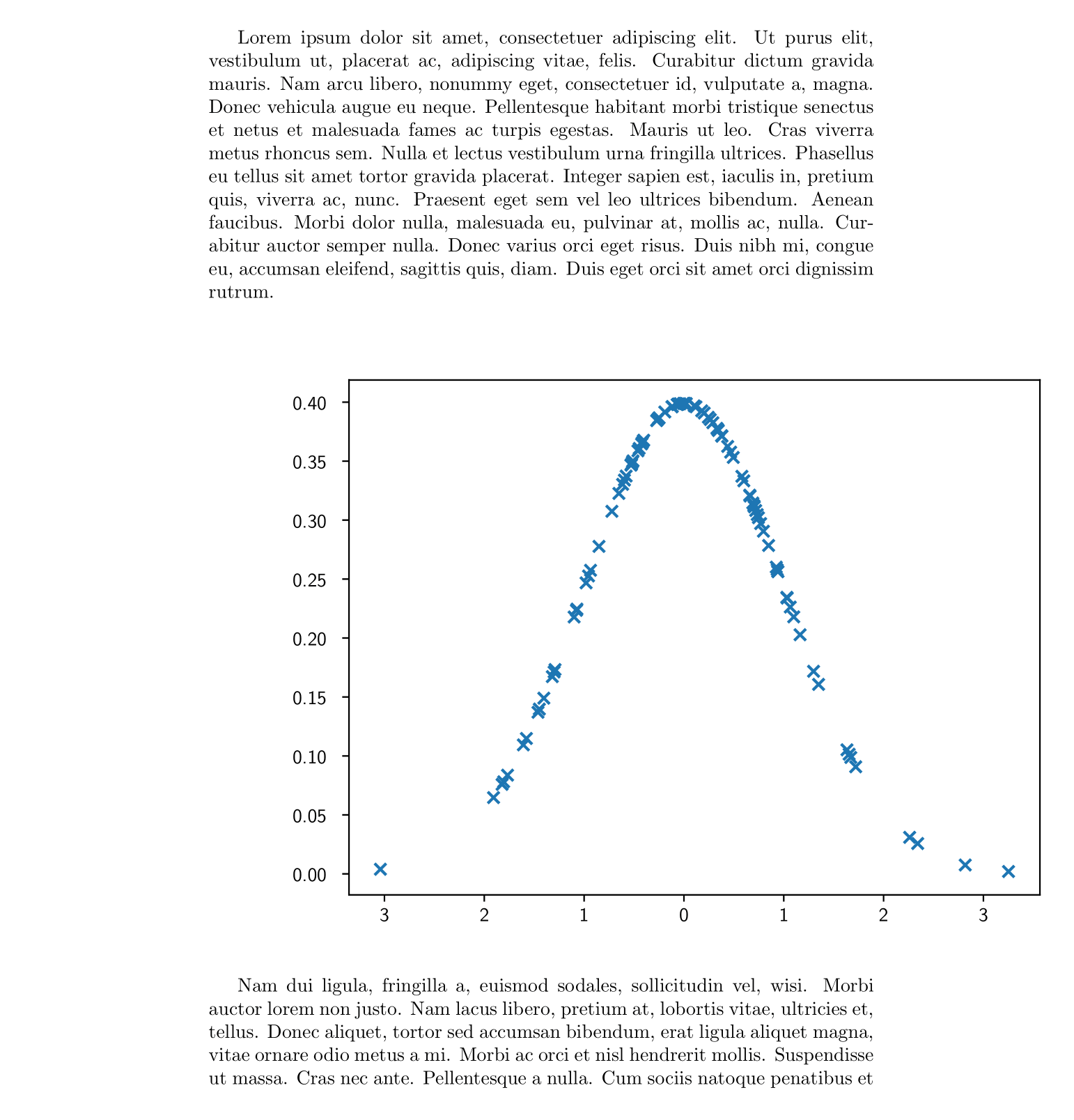
Fortunately, as we will see, it only takes a few steps to go from the above monstrosity to something much more endearing.
Setting the plot size
Our efforts so far have been rewarded with nothing but an eye-sore. But we can salvage something beautiful from it yet. First we shall consider the size of the plot: it’s obviously too wide for the document it sits in, and it has a rather unsatisfyingly square aspect ratio.
It’s possible to scale our figure within LaTeX, using a \scalebox or \resizebox
command. However, I prefer to determine my figure size at the matplotlib end of things. To
do this we first determine the textwidth of our documentclass. We can do this using the
\showthe command.
% your document class here
\documentclass{article}
\begin{document}

% gives the width of the current document in pts
\showthe\textwidth

\end{document}
If we recompile this .tex document compilation will halt once the \showthe command
is encountered. At this point the textwidth of our document is displayed.
> 345.0pt.
l.5 \showthe\textwidth
Here we see that our document is 345pts wide. To specify the dimensions of a figure in matplotlib we use the figsize argument. However, the figsize argument takes inputs in inches and we have the width of our document in pts. To set the figure size we construct a function to convert from pts to inches and to determine an aesthetic figure height using the golden ratio.
def set_size(width_pt, fraction=1, subplots=(1, 1)):
    """Set figure dimensions to sit nicely in our document.

    Parameters
    ----------
    width_pt: float
            Document width in points
    fraction: float, optional
            Fraction of the width which you wish the figure to occupy
    subplots: array-like, optional
            The number of rows and columns of subplots.
    Returns
    -------
    fig_dim: tuple
            Dimensions of figure in inches
    """
    # Width of figure (in pts)
    fig_width_pt = width_pt * fraction
    # Convert from pt to inches
    inches_per_pt = 1 / 72.27

    # Golden ratio to set aesthetic figure height
    golden_ratio = (5**.5 - 1) / 2

    # Figure width in inches
    fig_width_in = fig_width_pt * inches_per_pt
    # Figure height in inches
    fig_height_in = fig_width_in * golden_ratio * (subplots[0] / subplots[1])

    return (fig_width_in, fig_height_in)
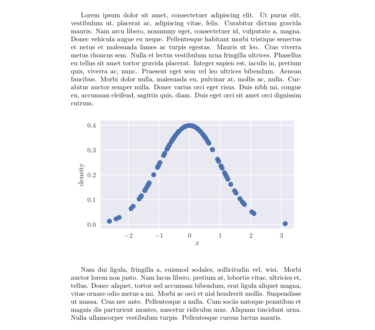
We can use this function to recreate our earlier plot so that it doesn’t extend outside of the margins, and so that it has a more aesthetic aspect ratio.
fig, ax = plt.subplots(1, 1, figsize=set_size(345))
ax.scatter(x, y, marker='x')
fig.savefig('norm.pgf', format='pgf')
Using LaTeX fonts
Okay, so we’re now within our margins. But the clash between the font in our plot and the font in our document body is rather jarring. Fortunately, this is an easy fix. To match the font between our plot and LaTeX, it’s enough to instruct matplotlib to use a serif font to typeset the text. To achieve this we update our rcParams as:
plt.rcParams.update({
    "font.family": "serif",  # use serif/main font for text elements
    "text.usetex": True,     # use inline math for ticks
    "pgf.rcfonts": False     # don't setup fonts from rc parameters
    })
Adding some style
Matplotlib style sheets are a great way to change the theme of your plots, without
having to alter your plotting routines. You can list the available style sheets with
plt.style.available. I have quite the penchant for the seaborn style at the moment. This
style can be applied with the command plt.style.use('seaborn').
Putting all of these things together, and using the set_size function as defined
earlier, we have:
import matplotlib as mpl
# Use the pgf backend (must be done before import pyplot interface)
mpl.use('pgf')

import matplotlib.pyplot as plt
from scipy.stats import norm

# Use the seborn style
plt.style.use('seaborn')
# But with fonts from the document body
plt.rcParams.update({
    "font.family": "serif",  # use serif/main font for text elements
    "text.usetex": True,     # use inline math for ticks
    "pgf.rcfonts": False     # don't setup fonts from rc parameters
    })


x = norm.rvs(size=100)
y = norm.pdf(x)

# Using the set_size function as defined earlier
fig, ax = plt.subplots(1, 1, figsize=set_size(345))
ax.scatter(x, y)
ax.set_ylabel('density')
ax.set_xlabel('$x$')

fig.tight_layout()
fig.savefig('norm.pgf', format='pgf')
Finishing touches
So, we’re pretty much there now. However, we can make a couple of small adjustments to our
.tex file to help set our figure just nice. Here we shall float our plot in a figure
environment, and also ensure that it is centered properly in our document.
\documentclass{article}

\usepackage{pgf}
\usepackage{lipsum}

\begin{document}
\lipsum[1]

\begin{figure}[h]
    \centering
    \input{norm.pgf}
\end{figure}

\lipsum[2]
\end{document}
Drawbacks of this approach
Though I do like this approach, and it is a convenient way of getting plots into LaTeX, it
does come with its drawbacks. If you’re working on a larger project, or simply one with
lots of plots, you’ll soon notice the compile time of your .tex document sky-rocket.
This is because at every single compile LaTeX is working to create your plots from the pgf
plotting commands. A solution is to realise each figure with a LaTeX standalone
documentclass. With a clever Makefile you should be able to keep your compile time down.
Another common problem with pgf plots is memory; once you’re producing plots
with lots of data points, the .pgf file grows very quickly. This memory usage
will quickly upset pdflatex, and before long pdflatex will refuse to compile
your document. It is possible to increase the main memory limit of pdfLaTeX.
Alternatively, LuaTeX can dynamically alter its
memory as needed.
Although these problems are surmountable with a little patience (and may not even be problems for smaller projects or simpler plots), I tend to stick to the approach I outlined in this previous post.