In Defence of the Humble Pie Chart
If you’re active in any Data Science communities—whether on Twitter, Reddit, LinkedIn, Discord, or wherever else—you’ve probably already encountered a member of the pie chart hate-brigade. In fact, in reading this post, there is a good chance that you’re already a member of this group, rallying to heap further criticism on your least favourite graphic!
Yes, data science communities are littered with posts and comments maligning the much-scorned pie chart. One really doesn’t have to spend too much time browsing these communities to see the pie chart receiving a good dressing down. Users criticise pie charts with many, often tiny, incomparable segments; the pie chart’s inability to communicate precise numbers, and their perceived general inferiority to bar charts.
See, for example, from Data to Viz’s post “The issue with pie charts”, or insider.com’s article “The Worst Chart In The World”. Even the pre-eminent Edward Tufte is a critic, quoting: “the only worse design than a pie chart is several of them”!
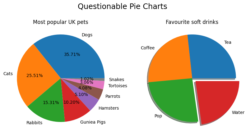
And truthfully, these criticisms have weight. It is undoubtedly true that pie charts are frequently used in situations where another graph would have been more appropriate. Pie charts with many segments generally are difficult to read, and it really is hard to make comparison between several similarly sized pie chart segments.
However, the pie chart’s misuse does not mean that it is an inherently bad graphic. Additionally, what was once a “hot take” in data visualisation has now become so often mindlessly parroted, that the debate itself has lost meaning and any semblance of nuance, deteriorating into a “pie chart bad; bar chart good” groupthink.
So, when might a pie chart be an appropriate choice of graphic? To think about this, we’re going to consider:
- The type of data we’re trying to visualise,
- The story we’re trying to tell,
- The context in which we’ll be displaying our graphic.
Considering points 1. and 2., I might conclude that an appropriate time to use a pie chart would be in situations when there is only a small number of groups to visualise (2–3 groups, say), and where accurate comparisons between similarly sized groups are not required.
Context (point 3.) is a very important consideration for what is an appropriate choice of graph too. Is your graph to be inserted into a technical report or paper, where motivated individuals will have time to inspect your graph at their own leisure, inspect your axes, draw their own conclusions, and so on? Or is your visualisation to be used in a PowerPoint presentation to a marketing team, where your slide will only be on-screen for a short period of time, and you want to keep your messaging clear and simple?
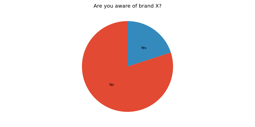
Consider the above plot. This pie chart may be a perfectly good choice of graphic to display in a PowerPoint presentation to a marketing team, where the message we’re trying to communicate is “We have low brand-recognition”. Note that the exact numbers might not be particularly important in this context: we might not really care if 16% vs 19% of people were aware of our brand, the point is that the majority of people weren’t brand-aware. Additionally, the familiarity and universality of the pie chart means that it can be quickly and intuitively interpreted—a great asset for a plot that’s on-screen for a short amount of time.
But that’s enough about pie charts. My argument in this post really isn’t supposed to be “pie charts are good”, nor is it really about pie charts at all.
What I’m trying to argue is that all graph types have their pros and cons, as well as situations when they are and aren’t appropriate. My argument is that as data communicators, we should always strive to choose the graphic which best communicates our message, in the given context, regardless of what graph that might be. My argument is that we should always think critically about how we might best visualise our data, and that graphical dogma doesn’t seem the best way to go about this.
PS. I offer no defence of the “3D” pie chart. That chart may truly be indefensible…